
*illustration by Viet Hyunh
Slack works for a wide range of companies—even ones with specialized workflows or strict compliance requirements. I was asked to help lead the design for a visual system that would be specific to Slack's priority lines of business, while incorporating Slack’s core branding and tone. The goal of this project was to enable marketers to better reach their customer base and create a system that was scalable across multiple industries—ranging from more traditional sectors like Financial Services to customer-facing sectors like Retail and Consumer Goods.
PROCESS
I worked with fellow designers Marcos Calamato and Viet Hyunh and copywriter John Knight to come up with the look and feel of each industry. The first step involved defining the rules and use-cases for the layout of the entire visual system. Once these rules were set up, we applied them to each specific industry and adjusted colors, illustrations, photography styles, avatars, and messaging tone to fit the industry. The branding would ultimately be applied across different marketing assets such as presentation decks, e-books, social media posts, and landing pages.
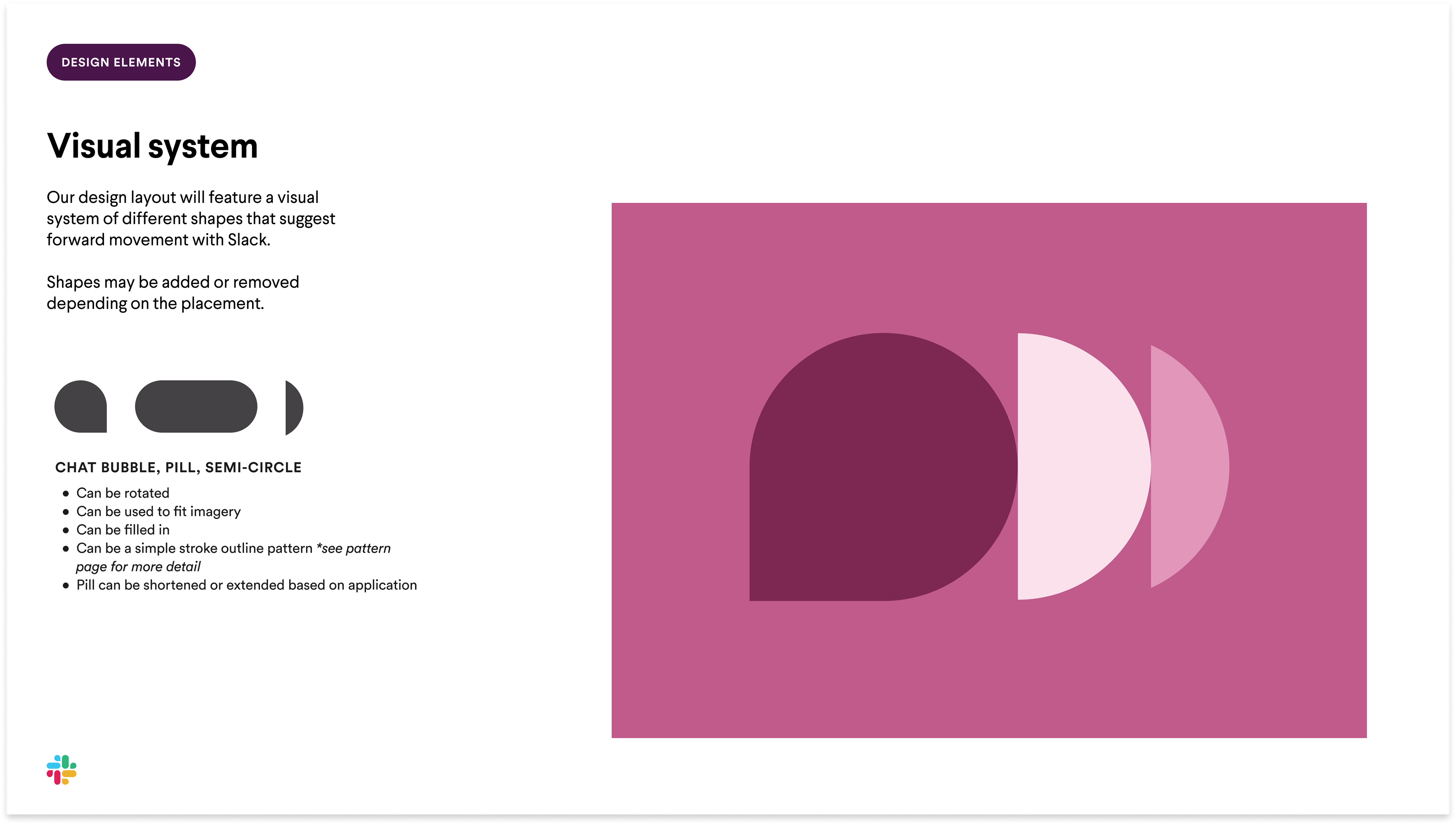
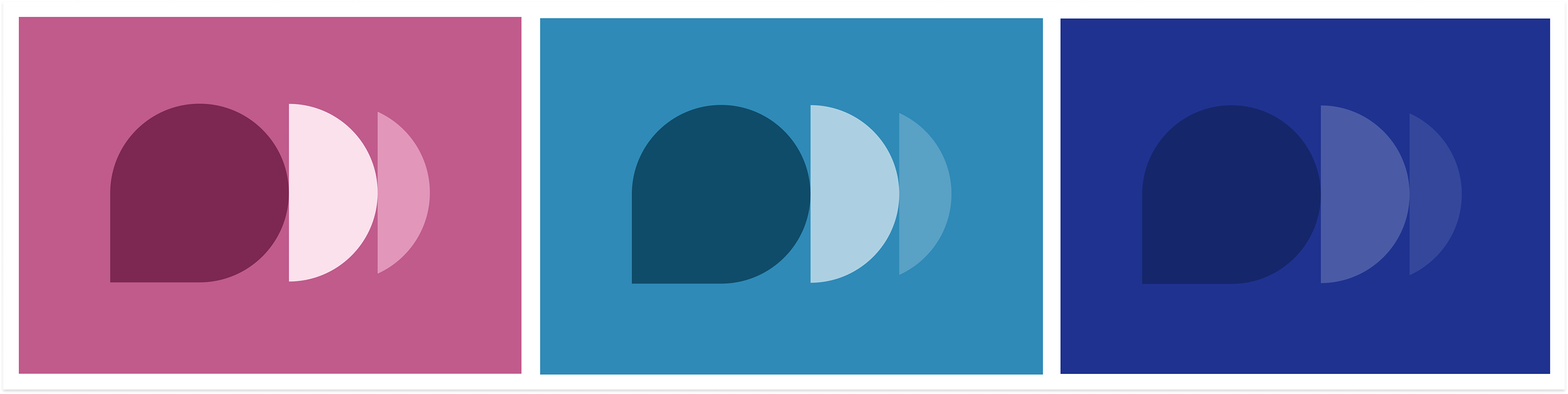
The basis of the visual system utilizes Slack shapes (the chat bubble and pill) and arranges them in a way that suggests forward movement.
COMPOSITION
We established some composition do's and don'ts when arranging the shapes. All shapes must be facing in the same direction, must be touching, and must be cropped to fit within the layout. Shapes should not overlap, face in opposite directions, or overcrowd the layout.
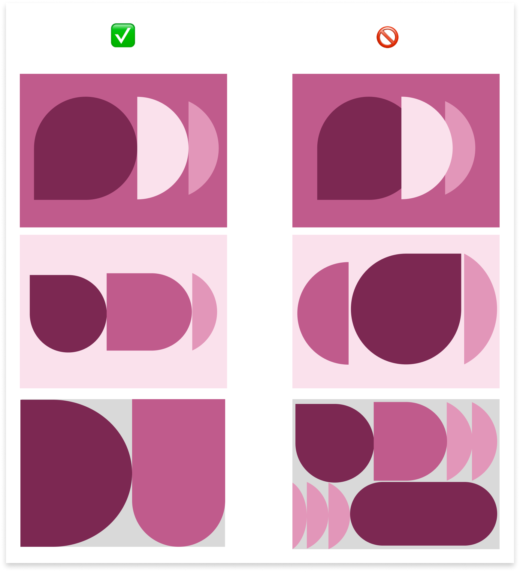
Composition do's and don'ts (Retail color palette)
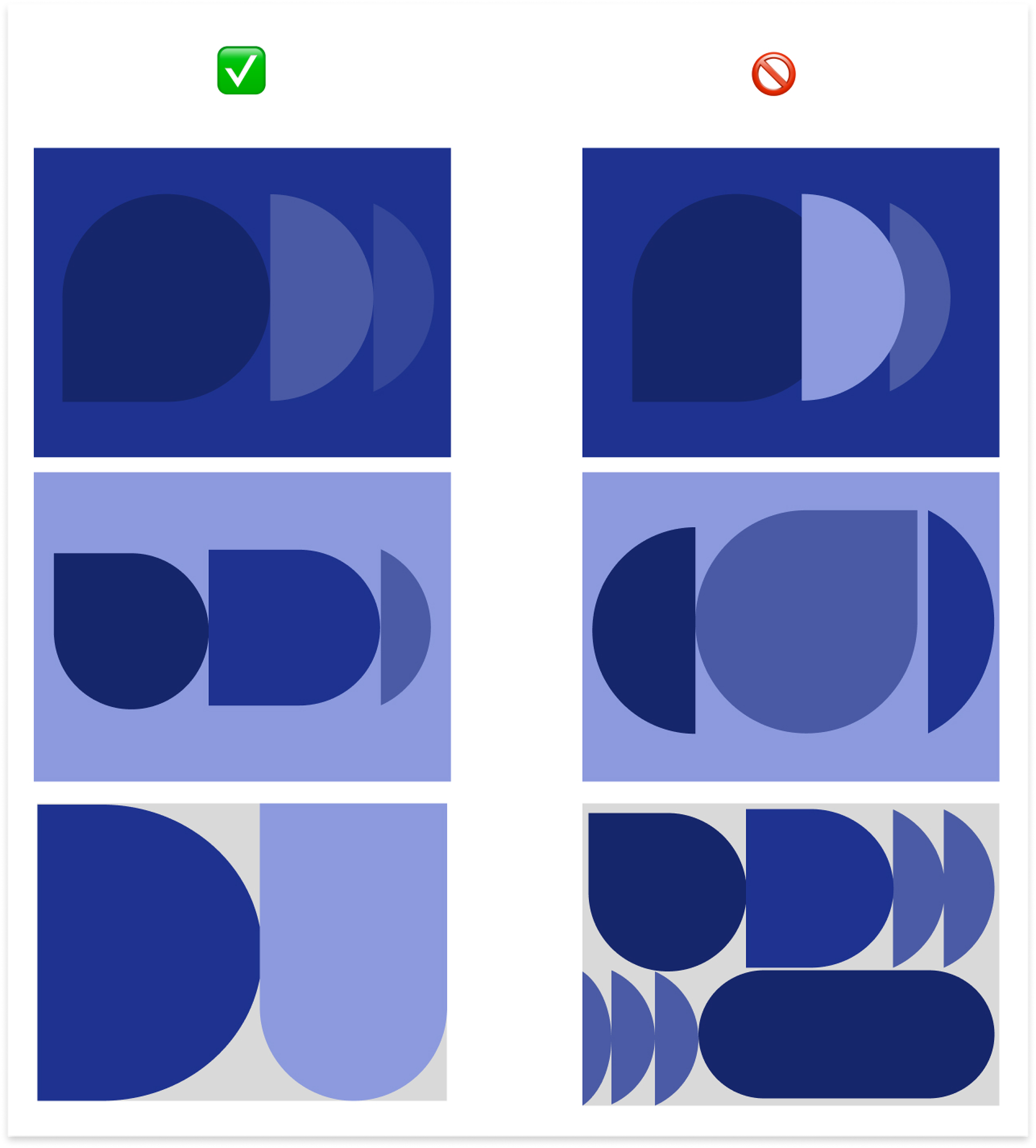
Composition do's and don'ts (Financial Services color palette)
COLOR
We chose a focal color for each industry and created a palette by adjusting the tones and tints of that color. In industries like Financial Services and Public Sector, we opted for traditional deep blues to instill a sense of security and trustworthiness. On the other hand, in industries like Retail and Consumer Goods, we chose brighter and more vibrant colors like pink to emphasize both approachability and playfulness.
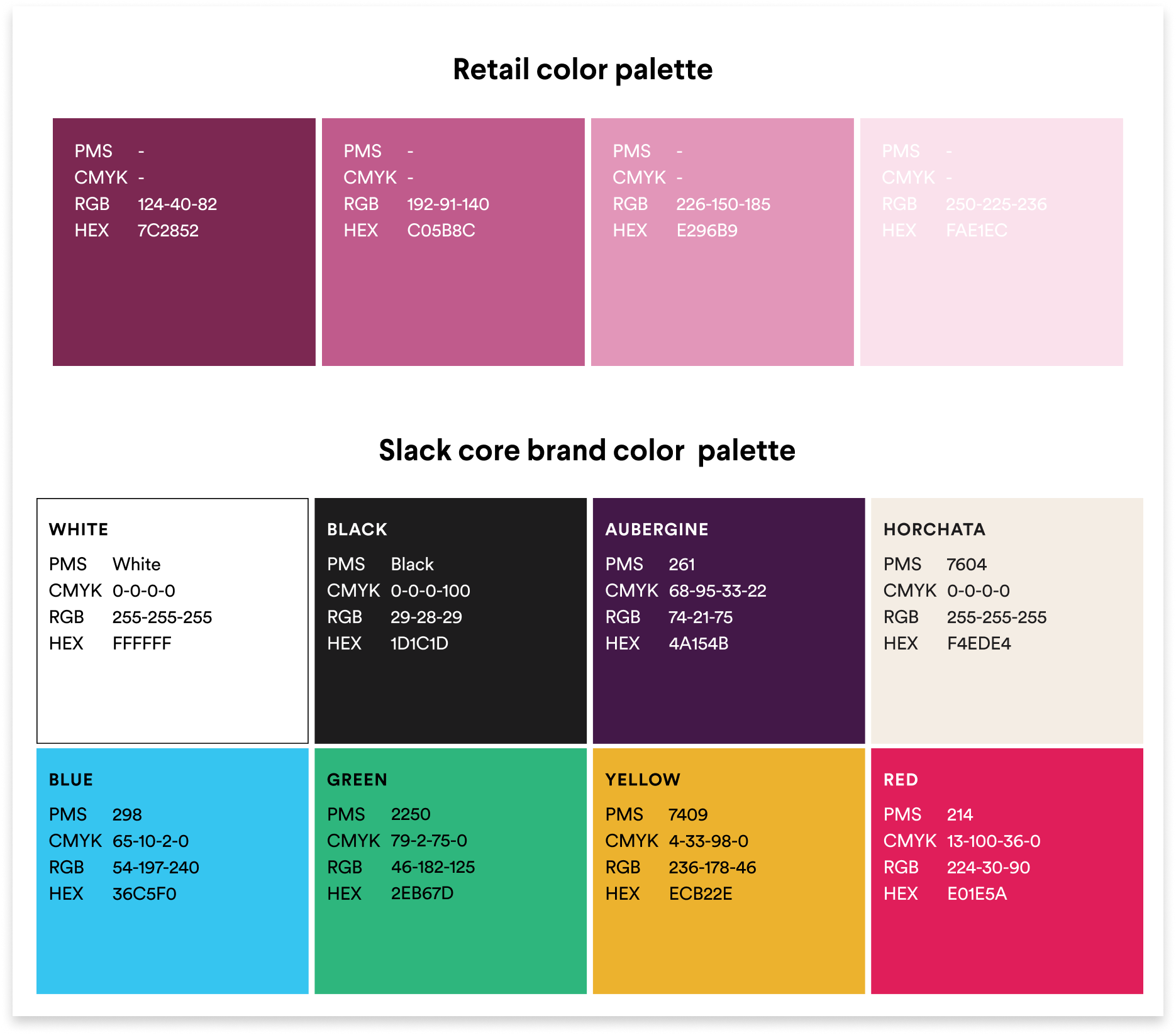
Retail color palette (detail)
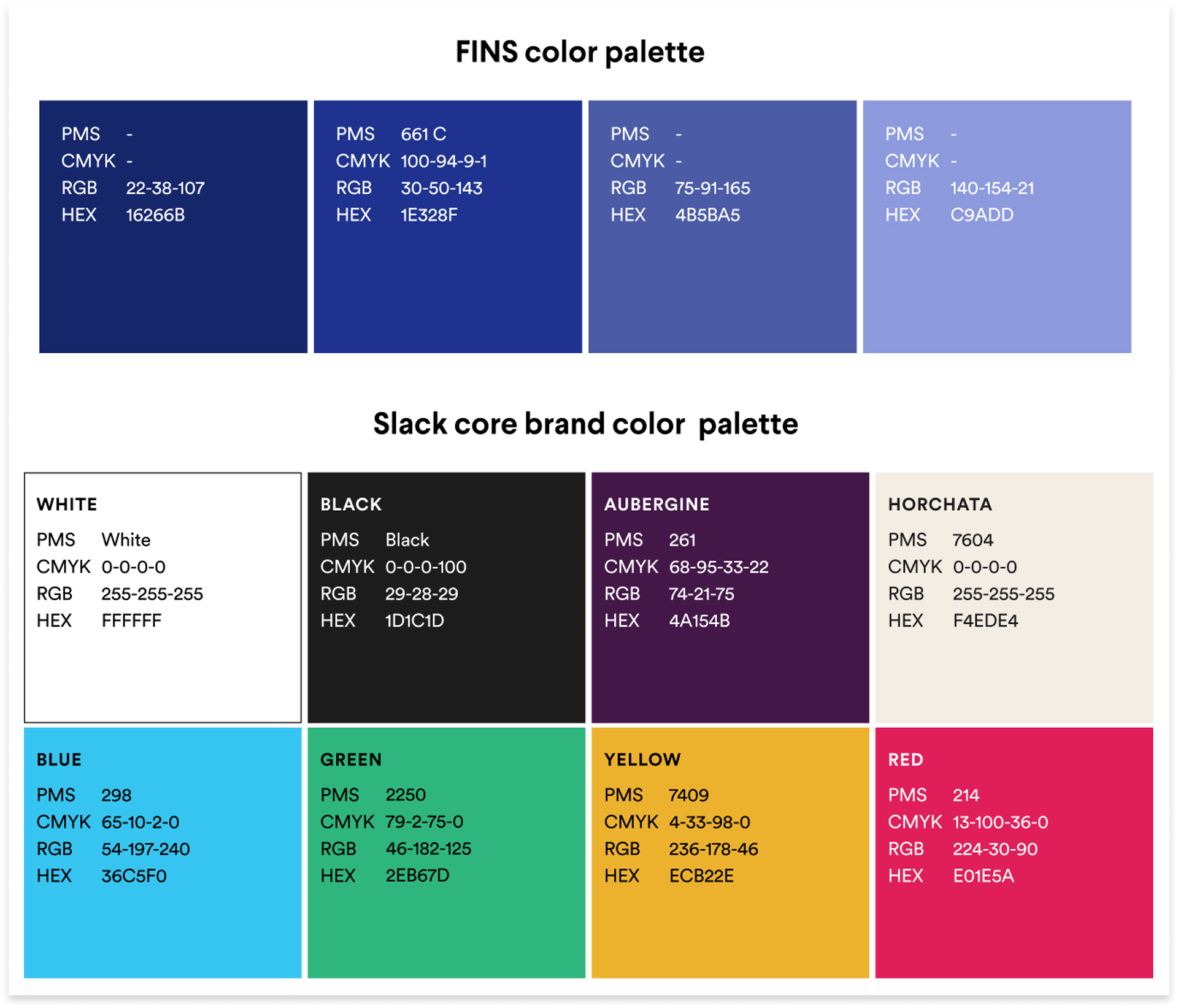
Financial Services color palette (detail)
Retail, Public Sector, and Financial Services color palettes
In addition, we established rules for color combinations to ensure high contrast as well as web accessibility.
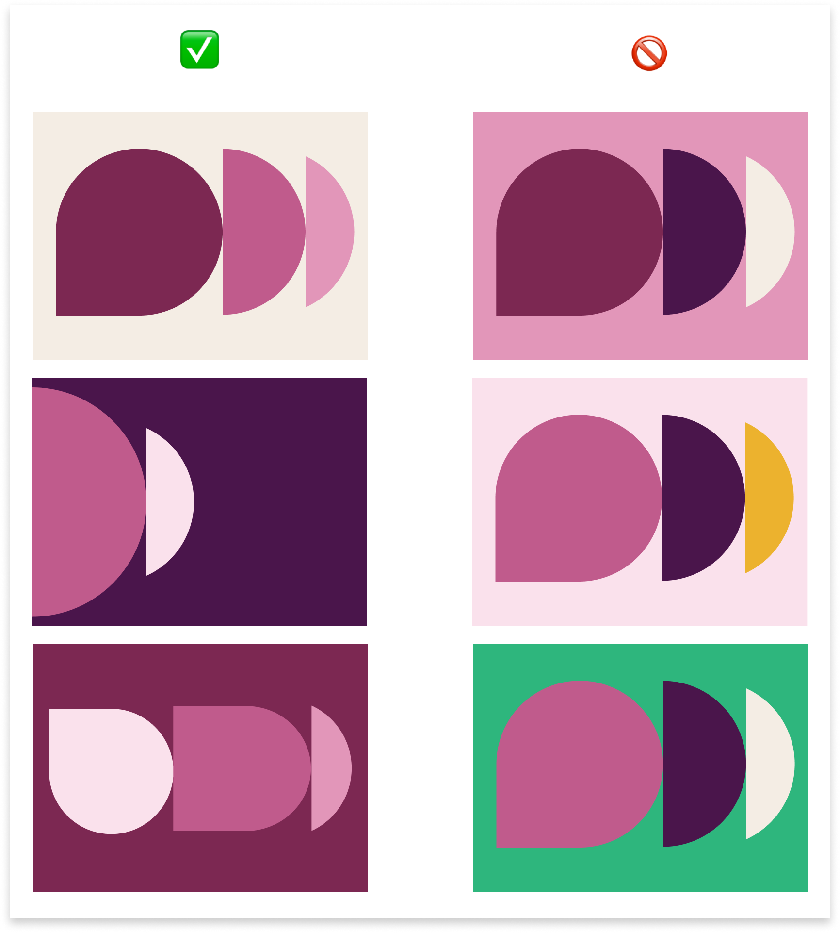
Color combination do's an don'ts
PHOTOGRAPHY & ILLUSTRATION
For photography, we incorporated well-lit corporate and lifestyle imagery, Slack-branded still life, and/or a combination of both. Illustrations are a core part of Slack's brand expression, and the same is true for each of the industries we branded. Each set of illustrations represents a core marketing message pillar and incorporates the industry color palette.

Retail photography set
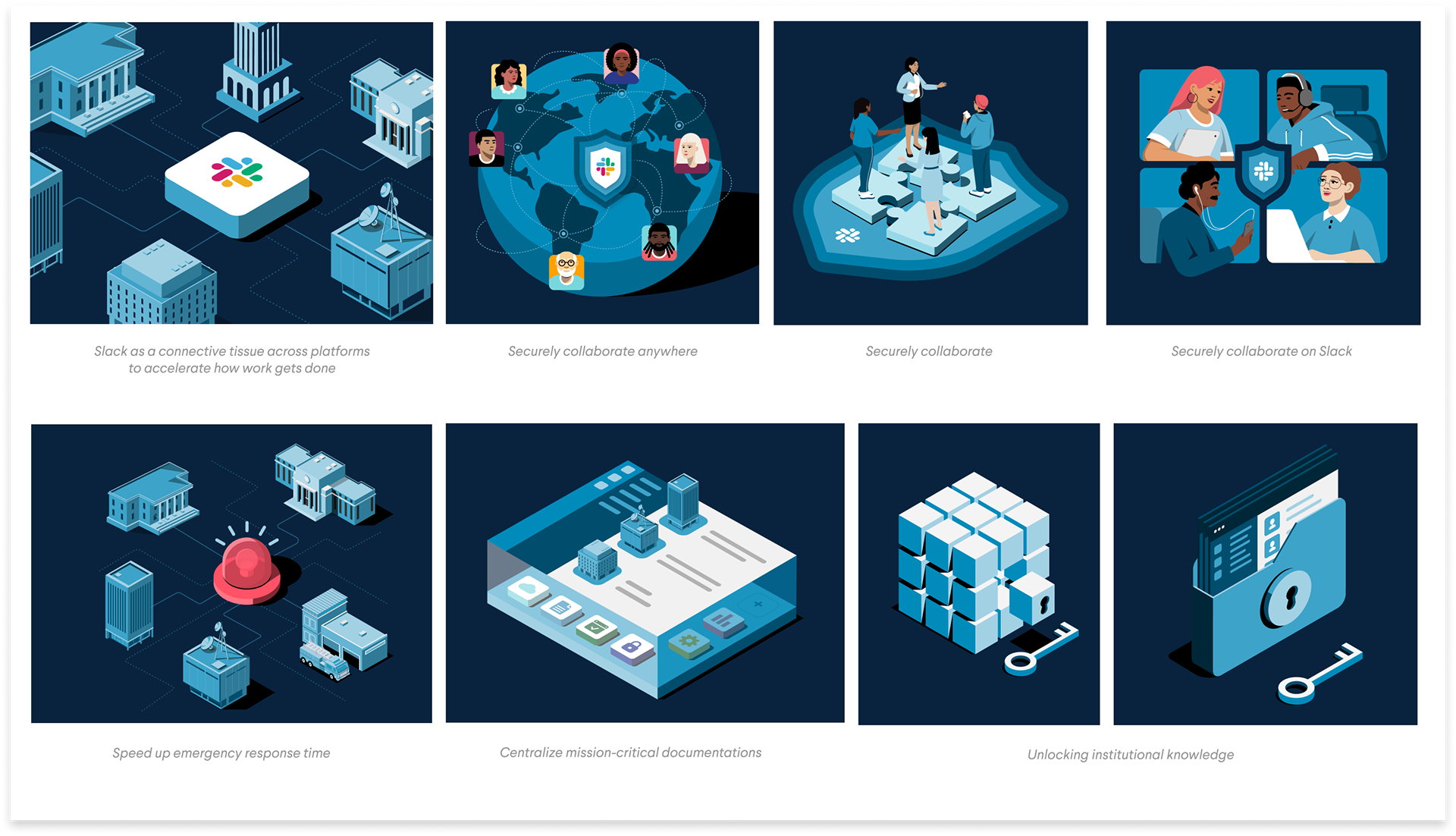
Public sector illustration set with messaging pillars below
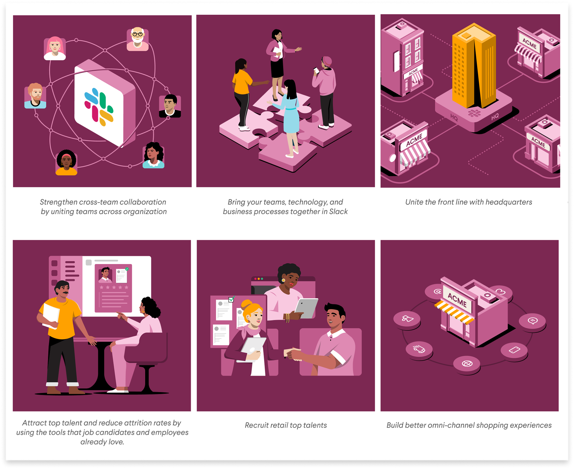
Retail illustration set with messaging pillars below
AVATARS
We selected avatars/personas based off the demographic and tone of each industry. For example, for Financial Services, we chose avatars of various age ranges and ethnicities all wearing traditional business attire and mellower background colors to emphasize professionalism and trustworthiness. On the other hand, for retail, we chose avatars with various age ranges and ethnicities but with casual attire and brighter background colors to provide a laid-back and friendly feeling.

Financial Services avatars

Retail avatars
MARKETING ASSETS
Once the visual systems were developed for each industry, we built out marketing assets like landing pages, e-books, and social media posts.
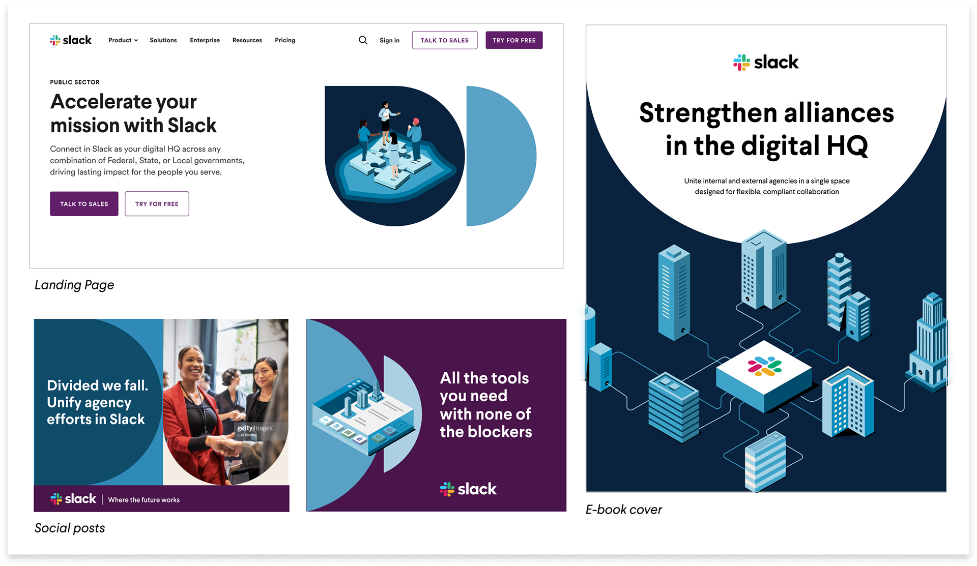
Public Sector marketing assets
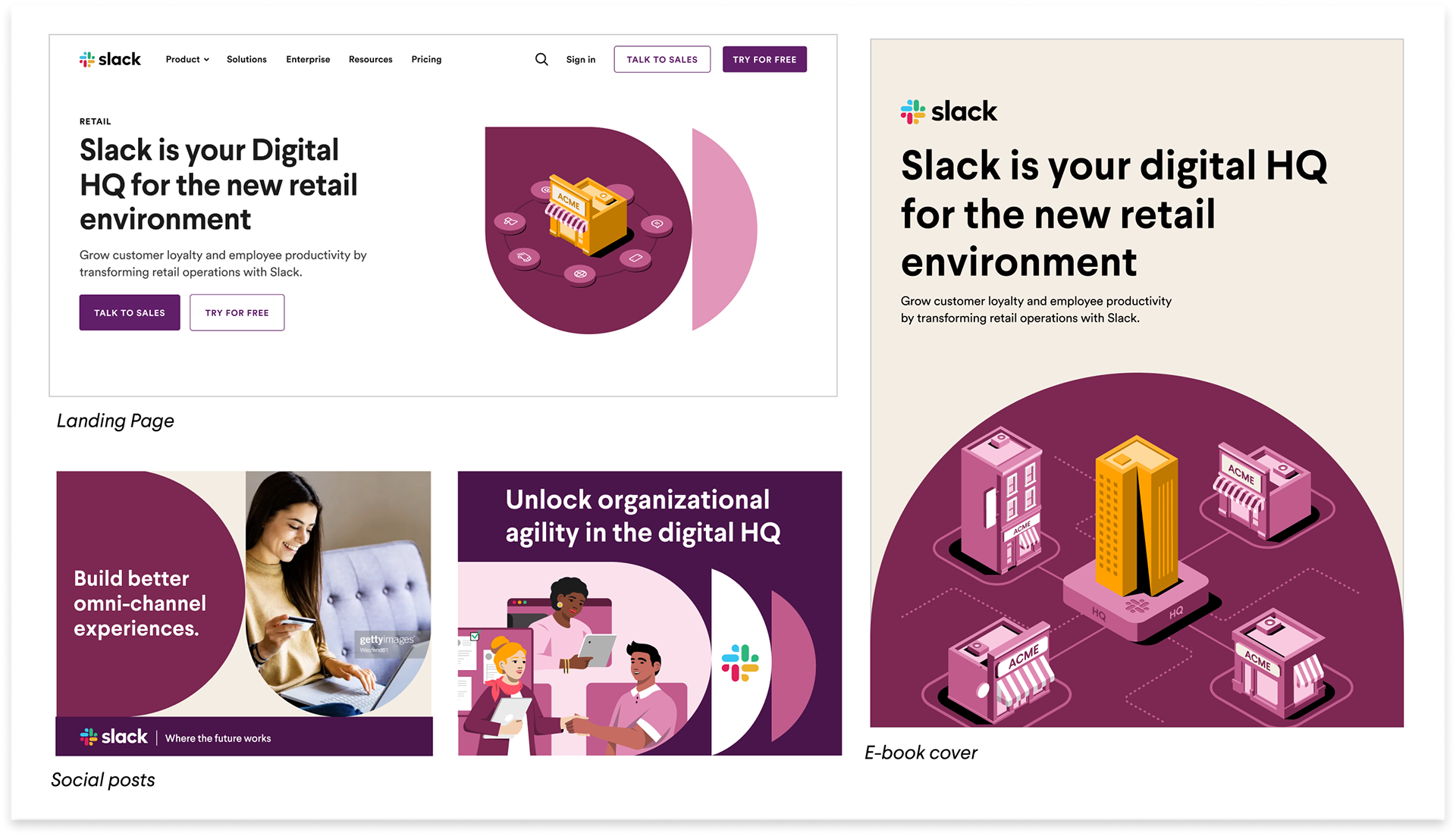
Retail marketing assets
TEAM
Senior Creative Manager: Jennifer Tan
Designers: Alison Jeng, Marcos Calamato, Viet Hyunh, Terra Spitzner, Michael Belen
Creative Operations: Lacey Maas, Jarrod Kelsey