
MagnifyMoney is a LendingTree company that provides consumers with free financial tools, resources, and guides. As a lead designer for the website redesign project, I was tasked with refreshing the outdated site with a new visual style and layout.
I worked under the guidance of senior creative director John Iafrate and with fellow designer Joice Samuely, to identify three major areas that needed in improvement in the current MagnifyMoney site:
1. Simplify the the homepage by removing distracting elements and focusing on content (as the site is content-heavy with articles and calculators)
2. Create a more intuitive navigation bar that is product-centric (the current navigation bar is action-centric and confusing)
3. Rework the blog and article layouts to add categorization of article types and to improve readability
STYLE GUIDE
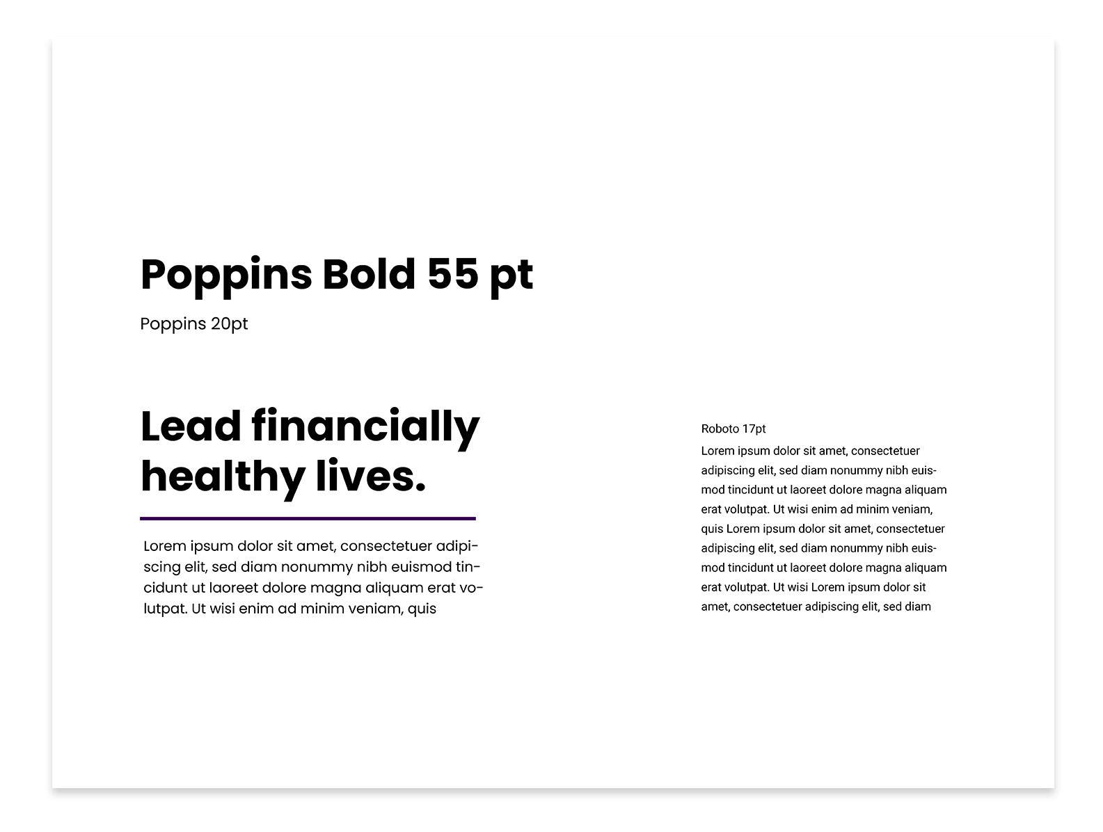
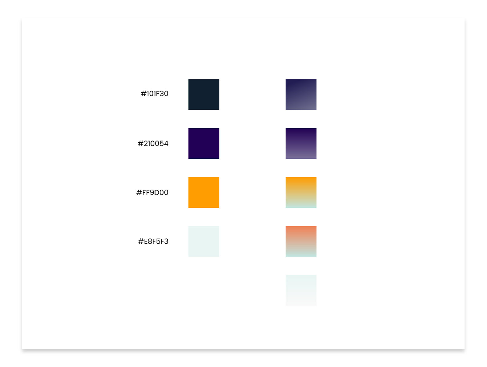
We wanted to focus on creating a strong brand presence without sacrificing readability and intuitive user experience. For our font choices, we decided on Poppins and Roboto which are simple and rounded. The colors incorporated a deep purple (MagnifyMoney's brand color), a deep navy (tying in LendingTree's brand elements), and a pop of orange for buttons.
The image style is illustrated with gradient 'blobs' to add a playful and approachable aspect to the brand. To add variety to the illustrations throughout the site, the image elements can be used individually or combined into different image clusters.
Typography
Color Palette
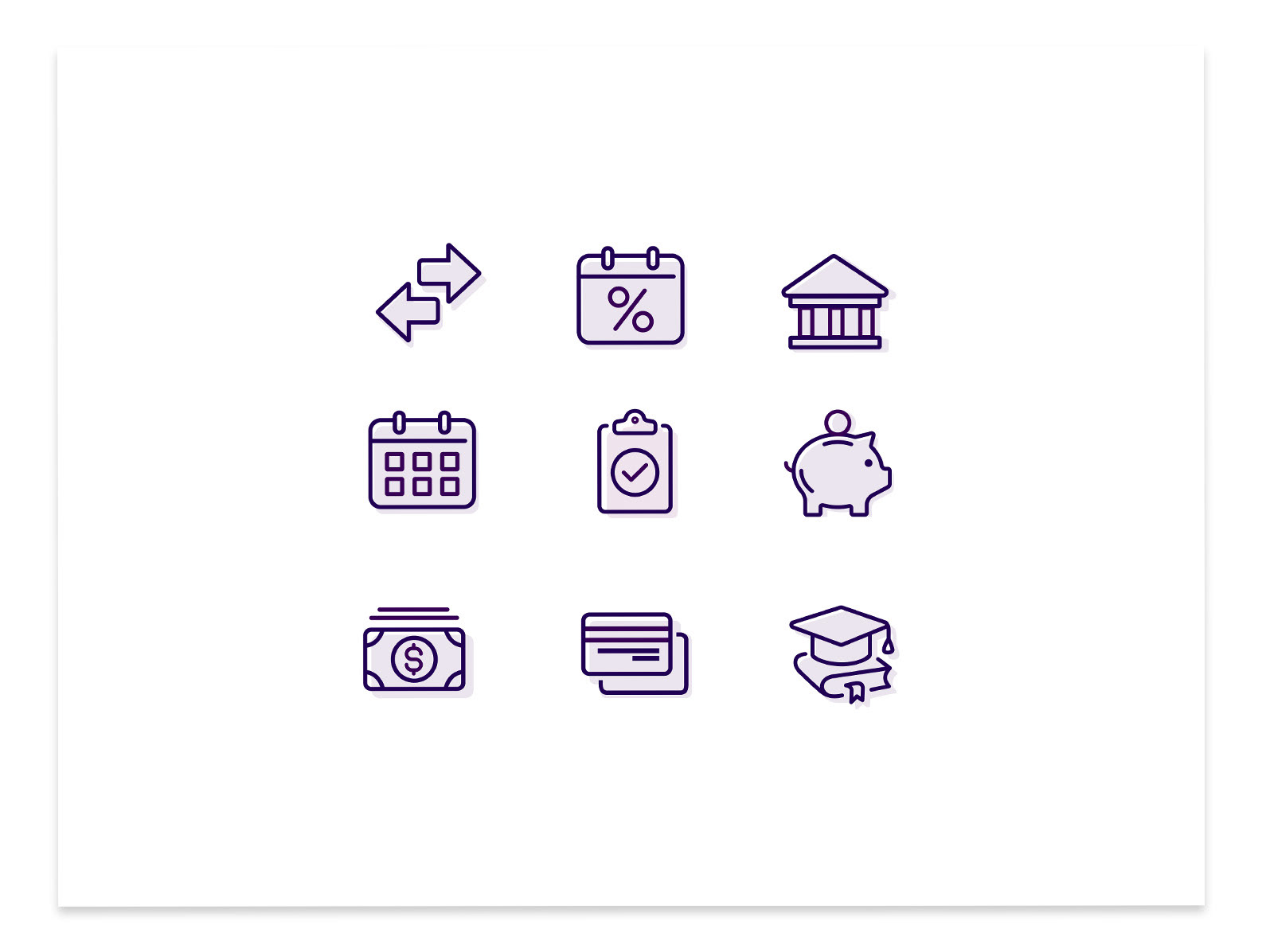
Icon Style
Illustration Style
DESIGN
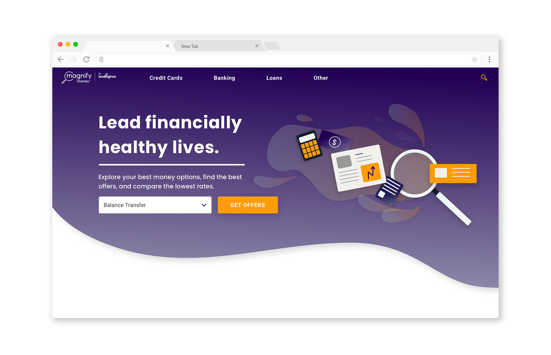
Our goal for the homepage was to categorize the different financial products MagnifyMoney covers, create sections for trending content, and to highlight the writers and editors on the team.
The menu bar divides the financial products into credit cards, banking, loans, and other. Within each product, users can select from the 'best of' reviews, comparison guides, and featured blog posts or financial tools relevant to the product. This structure was created to help users easily navigate what type of article or tool they are looking for because it is product-focused.
Menu Navigation
The highlighted content on the homepage showcases latest articles with an option to filter the information based on product type. This section also links out to the site's blog, where all of MagnifyMoney's articles live. Other forms of highlighted content include a curated 'Top Picks' section, a recommended reading list, a 'Tips and Tricks' section, and more.
These categorized content sections provide a simpler and organized reading experience for users.
Homepage Design
Blog Design