Radical Roots, a sustainable farm business specializing in permaculture, reached out to me to design and build out their brand visual identity.
PROCESS
The goal for this project was to establish a cohesive brand identity ranging from logo to typography, color palette, iconography, and digital and print assets.
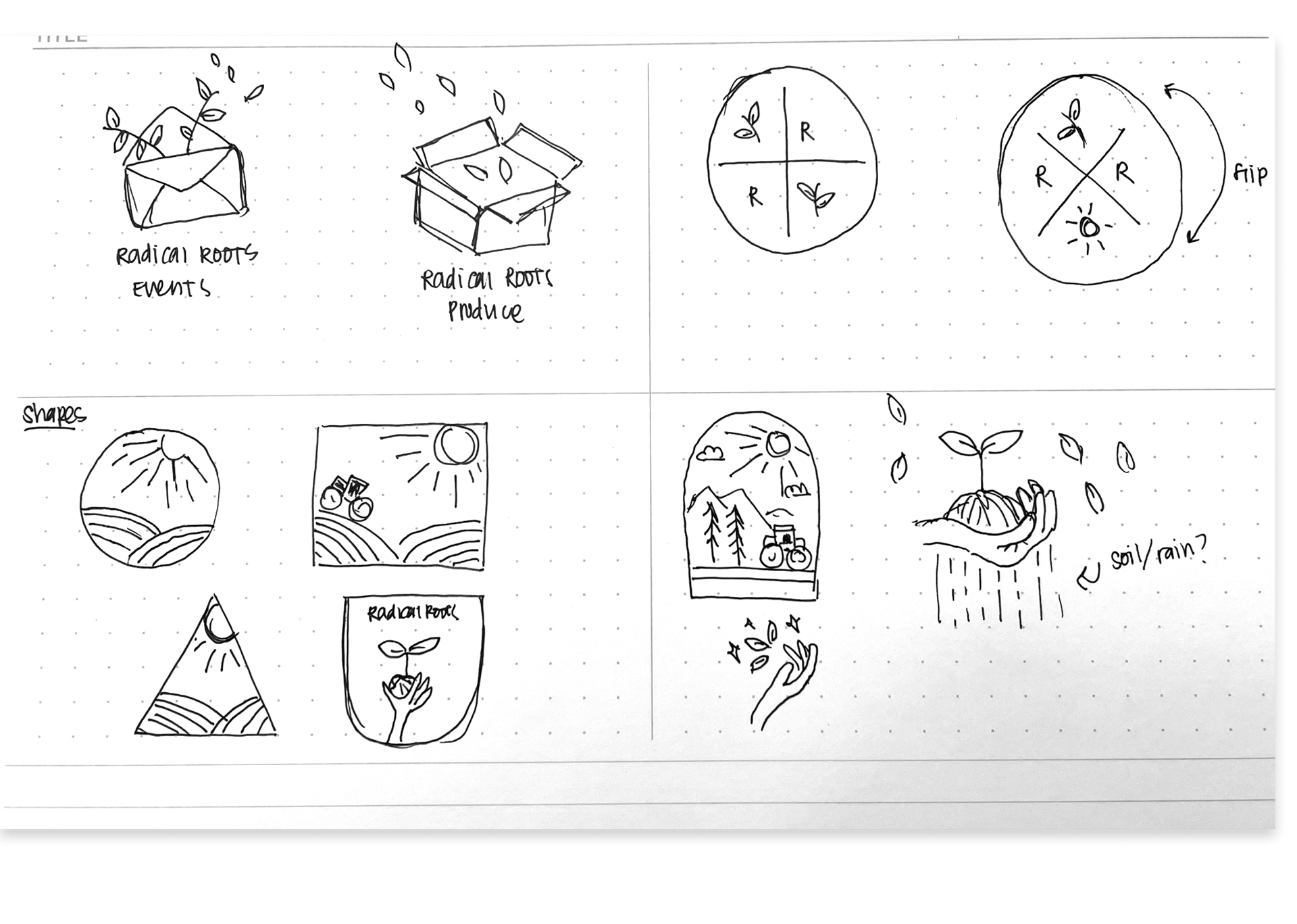
Initial sketches
For the logo, I explored clean and modern line illustrations with farm and plant imagery.
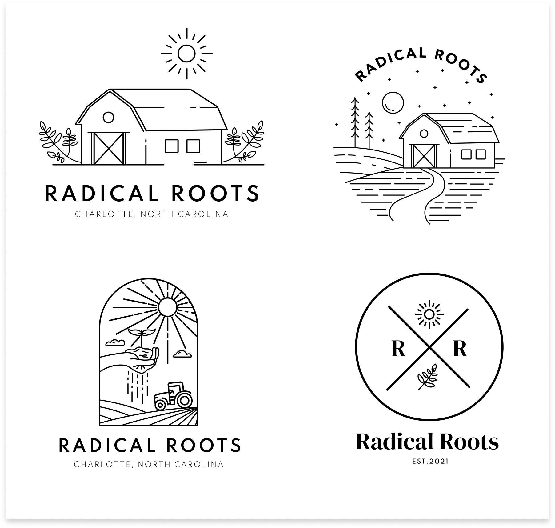
4 logo options
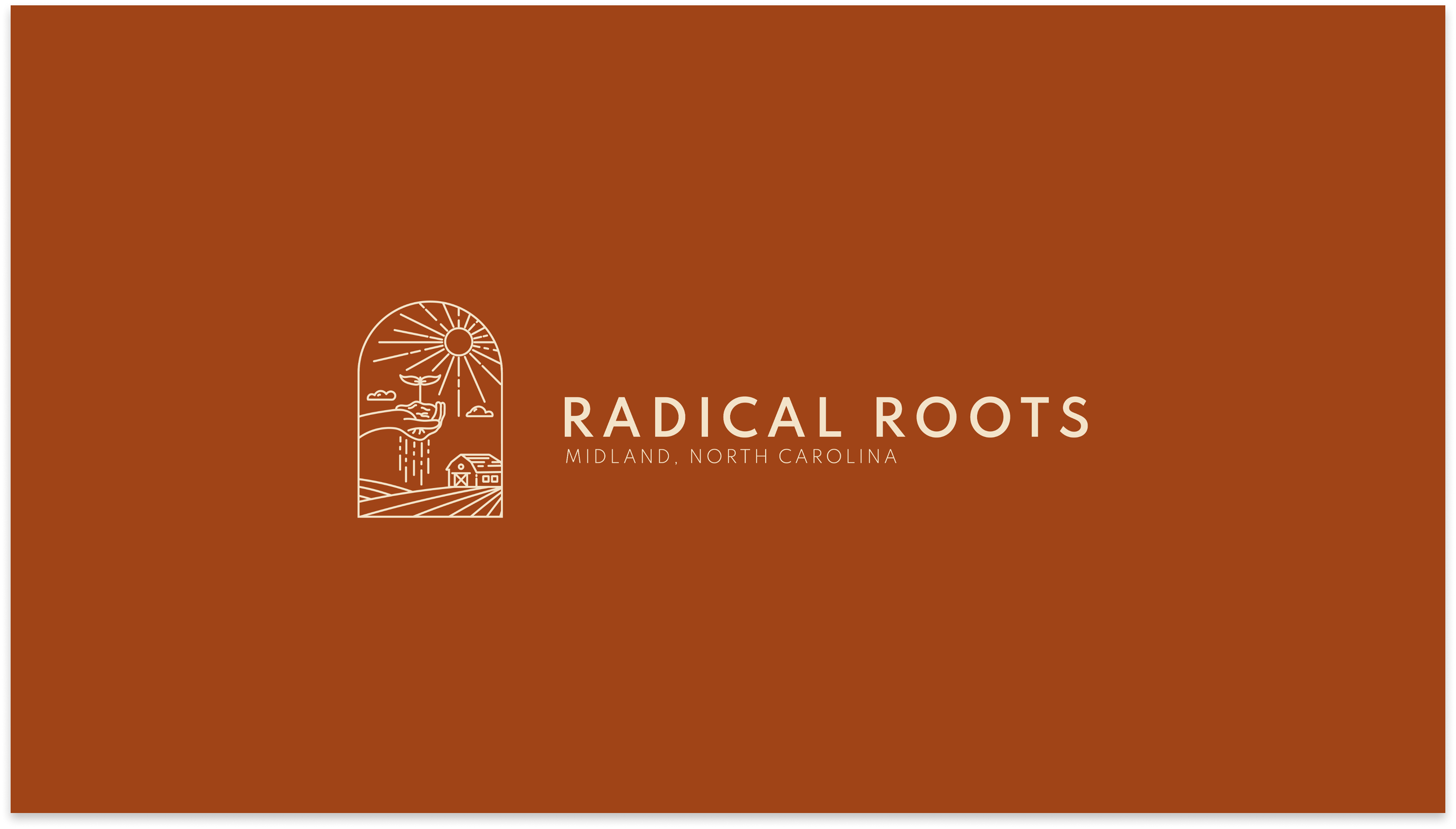
The finalized logo design depicts a window looking into the farm with various elements of the plant cycle, from sun to soil to rain.
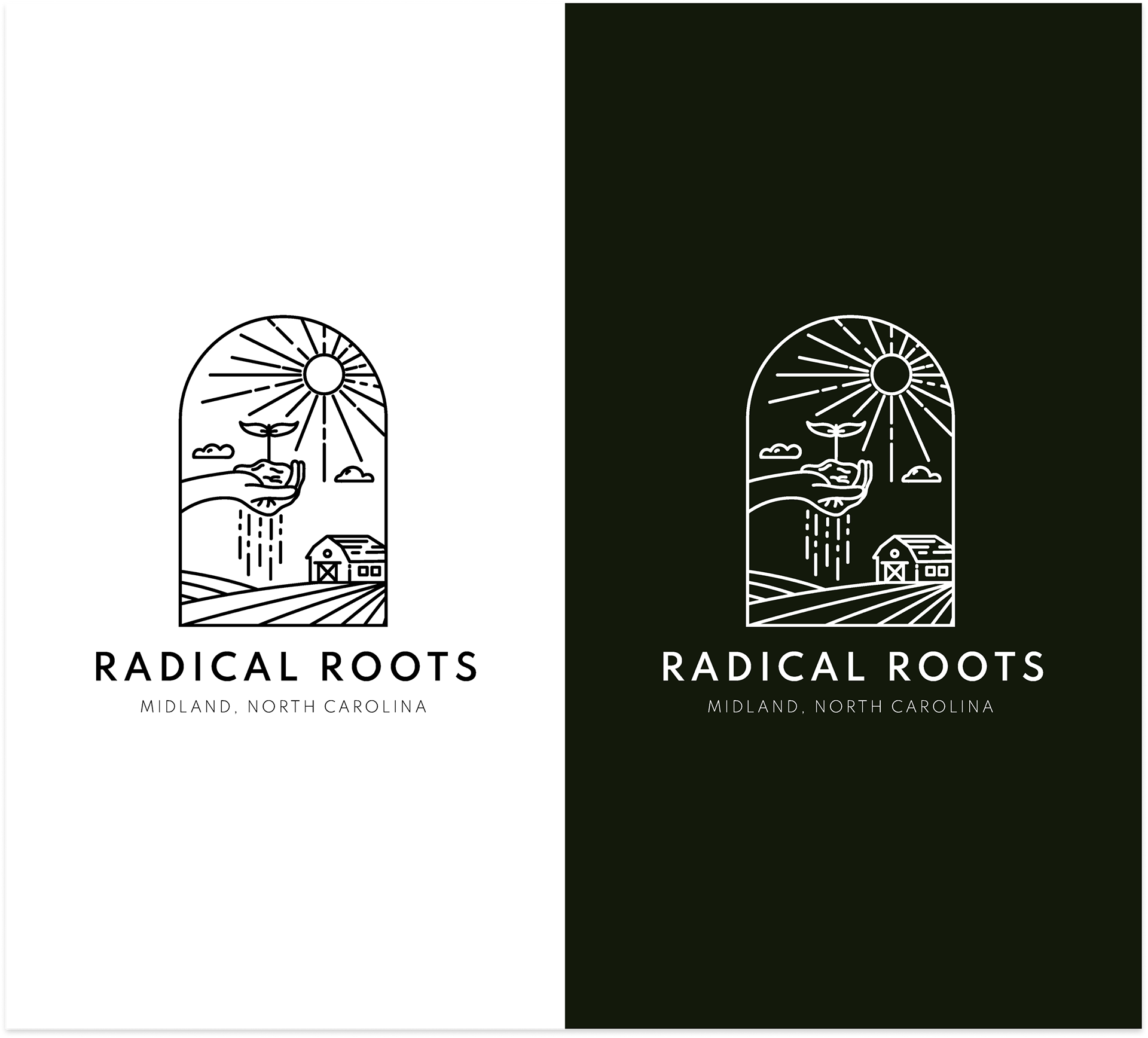
Final logo (on white and black)
In addition to the main logo, I designed two variations for the subcategories of the brand that highlights its key services: Produce and Events. The Produce logo calls out the role of harvest with the basket imagery while the Events logo highlights the role of invitations with the envelope imagery.
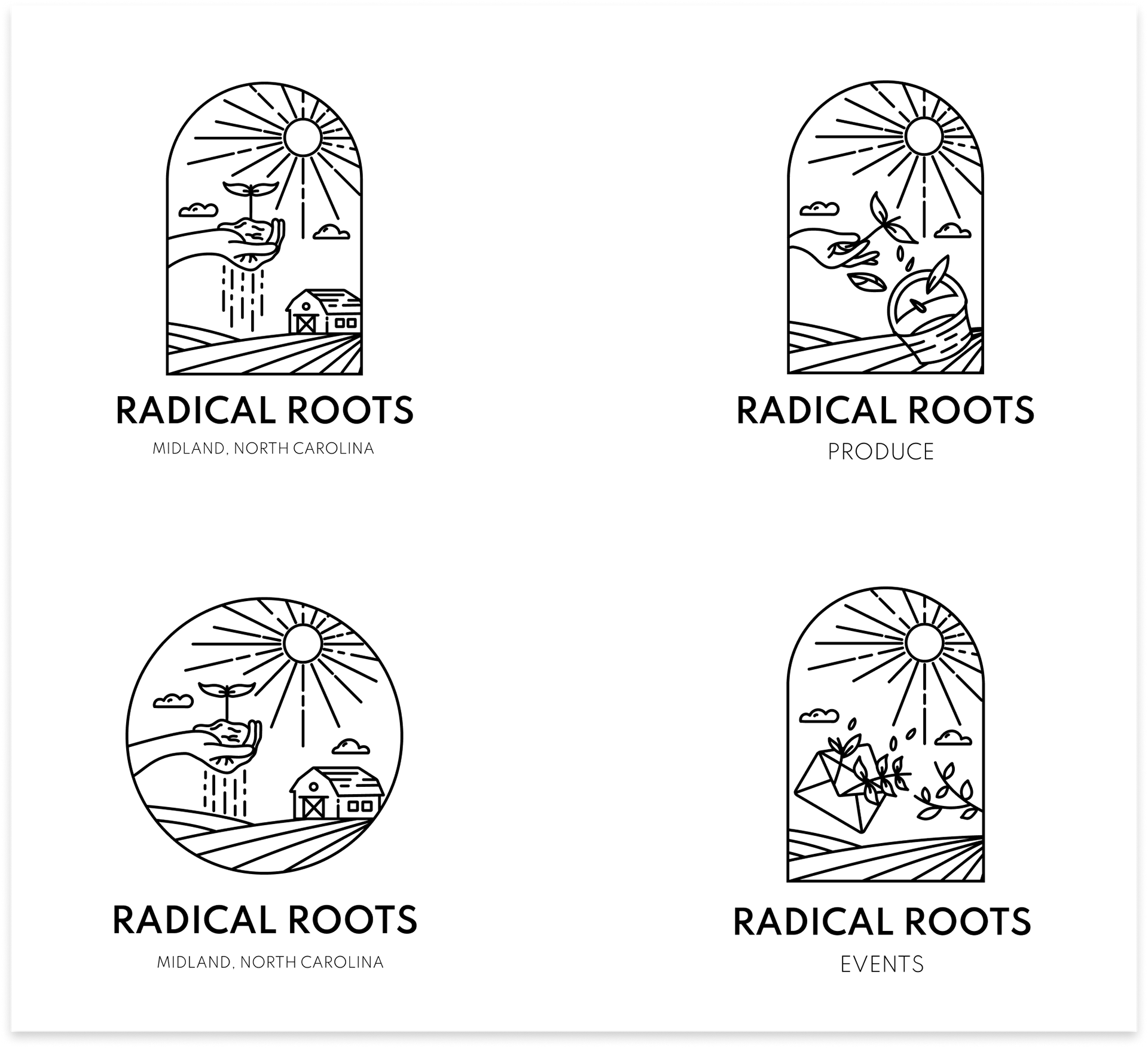
All logo variations (with subcategories: Produce and Events)
Once the logo set was completed, I came up with a color palette, type treatment, as well as a selection of icons. The color palette emphasizes the brand's natural elements with muted earth tones. Additionally, the icons pull from imagery used in the logo to maintain a cohesive look and feel.
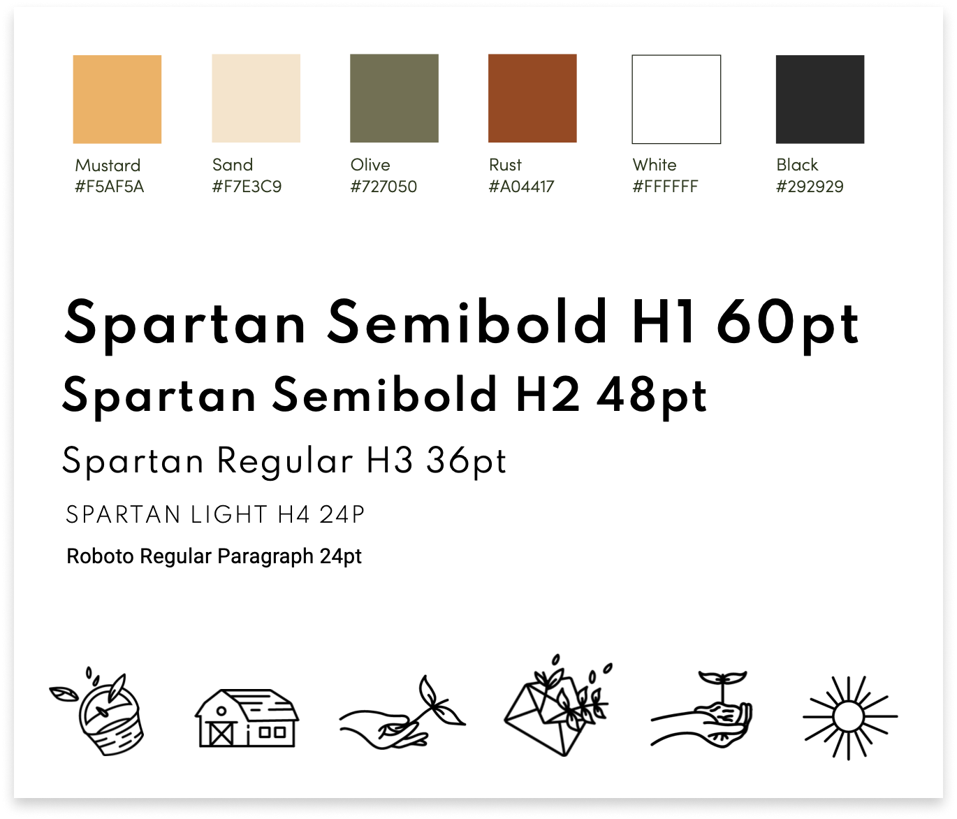
Color palette, typography, and icon set
With the finalized visual style, I applied the designs across print and digital assets (letterhead, business card, envelope, web banners). To push the brand even more, I mocked up the logo on things like coffee cups and wall murals.
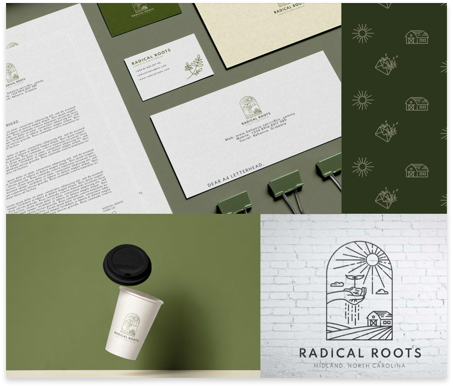
Logo in context